
When people think about branding or web design, they often focus on logos, typography, or photography. But one of the most powerful design decisions happens before any of those elements come together: color.
Color isn’t just decoration—it’s communication. It shapes first impressions, influences emotions, and helps people instantly recognize your brand. Whether you’re launching a new business or refreshing an existing one, understanding a few basic principles of color theory can make all the difference.
What Is Color Theory?
Color theory is the study of how colors work together and how they affect the way people perceive information. Designers use it to create visual harmony, establish hierarchy, and evoke specific emotions.
While there are countless ways to combine colors, most palettes begin with the traditional color wheel.
- Primary Colors: Red, Yellow, and Blue
- Secondary Colors: Green, Orange, and Purple
- Tertiary Colors: The colors created by mixing primary and secondary colors.
From there, designers create color schemes such as complementary, analogous, monochromatic, or triadic palettes to achieve different visual effects.
The Psychology Behind Color
Every color tells a story. Although cultural differences exist, certain colors tend to create similar emotional responses.
Blue inspires trust, stability, and professionalism. It’s a favorite among financial institutions, healthcare providers, and technology companies.
Green represents growth, health, nature, and sustainability. It’s commonly used by wellness brands and environmental organizations.
Red captures attention and communicates excitement, passion, urgency, and energy.
Orange feels friendly, optimistic, and approachable, making it a popular choice for brands that want to appear energetic and welcoming.
Yellow conveys happiness, optimism, and creativity, though it should be used thoughtfully since too much can overwhelm a design.
Purple suggests luxury, creativity, and imagination.
Black communicates sophistication, elegance, and authority.
White represents simplicity, cleanliness, and minimalism.
The key isn’t choosing your favorite color—it’s choosing the colors that best represent your brand and resonate with your audience.
Building an Effective Color Palette
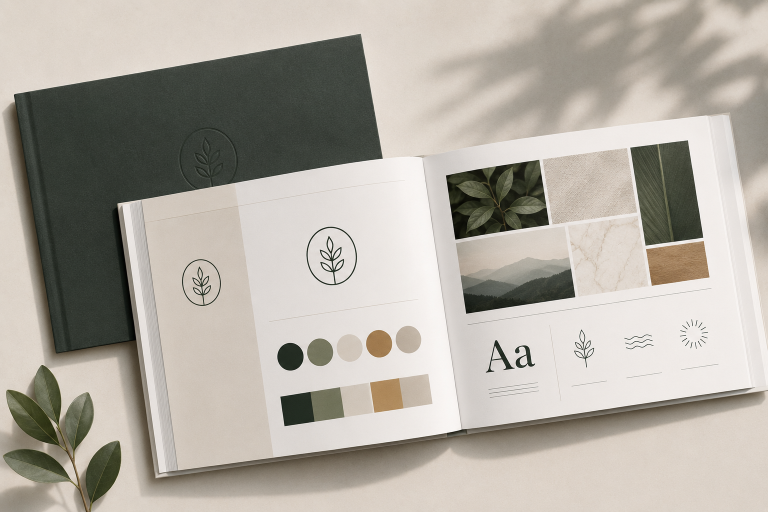
Most successful brands don’t use ten different colors. Instead, they rely on a carefully balanced palette.
A typical brand palette includes:
- A primary brand color
- One or two secondary colors
- Accent colors for calls-to-action or highlights
- Neutral colors for backgrounds and body text
This creates consistency across your website, social media, marketing materials, and printed pieces.
Color and User Experience
Good color choices do more than make a website look attractive—they help visitors navigate it.
Strategic use of color can:
- Draw attention to important buttons
- Create visual hierarchy
- Improve readability
- Guide users through a page
- Increase conversions
For example, if every button on your website is a different color, visitors won’t know where to click. But when your primary call-to-action always uses the same accent color, users quickly learn what action you want them to take.
Accessibility Matters
One of the most overlooked aspects of color theory is accessibility.
A beautiful design isn’t successful if people can’t read it.
Designers should always consider color contrast, text readability, and users with color vision deficiencies. Choosing colors with sufficient contrast ensures your content is accessible to a wider audience and creates a better experience for everyone.
Color Creates Recognition
Think about some of the world’s most recognizable brands. You probably picture their colors before you picture their logos.
That’s the power of consistent branding.
Over time, your color palette becomes part of your identity. It helps customers recognize your business instantly, builds familiarity, and reinforces trust with every interaction.
Final Thoughts
Color is far more than a design choice—it’s a business tool. The right palette can strengthen your brand, improve user experience, and leave a lasting impression long after someone visits your website.
Whether you’re creating a new brand or redesigning an existing one, investing time in thoughtful color selection pays dividends across every piece of your marketing.
Because great design isn’t just about looking good—it’s about communicating clearly, connecting emotionally, and helping your audience remember who you are.